A well-written content is what sets your site apart from the rest and conveys the right message about your business to your target audience. In addition to reaching the masses, interactive content also majorly contributes to the success of your website. All the other elements of your site fulfill a secondary role. In fact, if your site has powerful taglines, the striking design will only add to the effectiveness of the content. The design itself doesn’t sell.
In reference to design projects, oftentimes designers begin designing a project without comprehending the content. However, the first step to designing a project is to go through the content. Then formulate the design and how the content goes with it. This process of considering the content first before designing is known as “Content-First design concept”.

Content Specialist Kristina Halvorson says in an interview, “Content should drive design decisions and the entire layout is to be designed to support the content”.
Another statement about content and design by Jeffrey Zeldman states that content precedes design. Design in the absence of content is not design. It’s just decoration.
The fact is that web users are looking for quality information, not the design. A web page with an ordinary design but the quality content does much better than an extraordinary design with scanty text. Of course, a website design is imperative in leaving a good first impression on web users, but your website content is what promotes return traffic. Therefore, content and design are related and should work together, one is totally useless without the other.
Content-first Design Concept
Let’s picture it this way, an editorial designer does not begin laying out the design of a book before it is been written. And an interior designer does not start designing the interior of a house without understanding the architecture of the building. Both the professions have to follow the function and when it comes to the website, the function is carried out by the content.
Content is not just content, it consists of a range of media such as interactive words, plain-old text, audio, videos, and graphics. In a nutshell, the content-first design is all about understanding the purpose of the design and how it is going to achieve that purpose.
Benefits of content-first design concept:

Content-first design concept renders various benefits ranging from overall well-planned design vision to removing designing issues before even getting started.
1. Optimize the content:
Using content-first approach makes it easier to understand clients’ requisites and design the project accordingly. As an instance, if your client’s site is about videos and images, you can design interesting ways to display videos in an effective manner. If they are planning to build a blog, perhaps you can lay a beautiful card layout.
2. Consistent Interface:
When you know what type of content your site is going to have, it becomes easier for you to design a layout that works across all sites. This promotes consistent interface and prevents the creation of numerous messy combo classes.
3. Saves you from rounds of iterations:
When a design of the project starts without keeping content in mind, the process devolves into rounds of endless iterations and repetitions. Content first design concept fosters efficiency and allows you to consider even the minutest detail before even getting started, which eventually saves you a lot of time.
4. Conveying the right message to the right audience
No matter how beautifully a website is designed, if the content is subpar, there is no way the website can leave a positive impact on the visitors. When content is the central focus, a designer understands the goals and functions of the website. Rendering a design with unlimited elements, special effects and options will only distract the visitor from the content. Knowing what the website has to offer will make it easier for the designer to narrow down its creativity and add only the relevant elements.
Factors to consider while designing a project:
1. Understand the voice and tone of the content
Now that you know you need to go through the content first, it’s time to understand its tone and voice. What tone does it use? Is it clear, uniform and easy to follow? Or it’s serious, chaotic and straightforward? The tone of the content plays a huge role in designing a project. There would be a huge design flaw if your layout does not match the copy. As an instance, if your content uses a formal tone, make sure the design resonates with the formal tone of the content.

However, what if there isn’t any voice or tone of the content? How are you supposed to design the project? Well, this is where you can bring your creativity in.
- Study the content and think what the voice and tone should be – jovial, serious, fun, informal, formal and use your skills to highlight it.
- Also, make sure you understand the target audience and formulate a layout that does not distract them from the real deal – the content.
- You can also make the changes in the content during the design process to add more connection between design and content.
- Contemplate the actual objective of what you are designing. Make sure that the content and design guide the visitors to the call-to-action of the website.
2. Make it Readable

Being a designer, your main objective is to make all the content of the site easily readable. Making the content readable includes various aspects such as typography, color, font family, visual and so much more.
Keep in mind following points to ensure the best possible design.
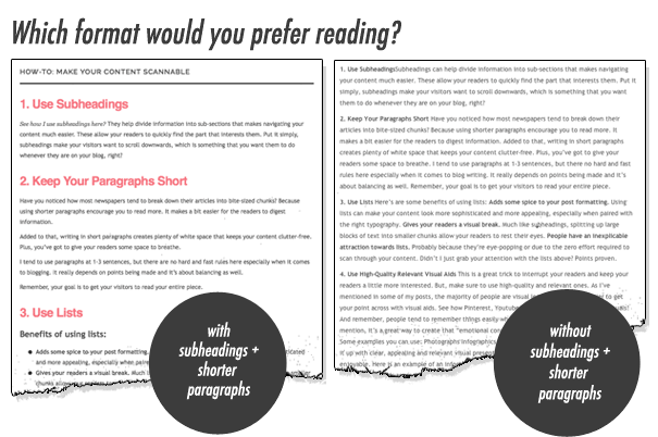
- Break up the content visually. Nobody is interested in reading long paragraphs of text. The best way to make the boring content interesting is to break them up into smaller sections along with few visuals.
- Make contrasting your best buddy. It consists of typography, color and size options. Make specific words or phrases bold or italic to emphasize them and draw users attention directly to them.
- Use highly readable font families only. There are various fonts that have been used as a life savior for a variety of projects like San Serifs, Calibri etc. Also, make sure that the font weight is appropriate for the users as well as complements your design.
- Use visuals to highlight the main points mentioned in the content to make them easy to understand by the end user.
3. Whitespace – letting your content breath

Whitespace is a great concept that plays a crucial role in improving the readability and usability of a website. As a matter of fact, you wouldn’t want to bombard your visitors with numerous elements, images or content on the web page. Whitespace is imperative to break up your page whilst emphasizing content and all the elements you probably have integrated into the design. A small space between two phrases or paragraphs does a lot of good to the user by making the webpage clutter-free. It gives an untidy and polished look to your webpage and allowing your content to breathe.
4. Main areas to focus
As a designer, there are three key areas where you have to work on – Headlines and subheadings, the story and calls-to-action.
Headlines and subheadings
There is a no denying the fact that headlines and subheadings are the most crucial parts of a website design. They are biggest blocks of content which will draw users attention to other content blocks. The design and color choices you make for headlines and subheadings can expand the meaning of these phrases or words.
The story or main content

The main content of the webpage determines the design of the whole page. In fact, the design of most of the projects revolves around the main content of the page. Thus, it is important that you have a good understanding of this section and formulate the design accordingly. Carefully plan typography, text color, size, font family and font weight to make it readable for the users.
Call to action (CTA)
Call to action is the reason why you are designing the whole project in the first place. Every element of the design, the marketing strategy of the business and the motive of writing quality content revolve around CTAs. But there are times when these elements are overlooked.
Call to action buttons should be designed with utmost care and intelligence. The main objective of adding CTAs is to draw the attention of the users and make them click on the buttons. Thus, when designing these button make them very concise and easy to comprehend.
Use bold typography, vibrant colors (if necessary) and clean font family. Also, make sure the action is short such as “subscribe here” or “get a quote”.
Conclusion
In the online world, content and web design are two essential components that determine the success rate of a site. Using appropriate techniques to create an attractive and striking design that well complements the content is the key.
Remember, design and content go hand in hand, a good design is nothing without quality content and quality content is nothing without an appropriate design.


