Sprites were originally invented as a method of quickly compositing several images together in two-dimensional video games using special hardware. As computer performance improved, this optimization became unnecessary and the term evolved to refer specifically to the two-dimensional images themselves that were integrated into a scene.
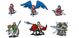
Sprites were displayed over a static or dynamic background image, and the positioning of the sprite was controlled simply by the hardware controllers.
Apply Video games images render techniques above to Web development then we have CSS Sprites. In fact, CSS Sprites are not new, in some situation they can bring significant advantages and improvements – particularly if you want to reduce your server load.
CSS sprites is the technique of combing images to lessen the number of calls that need to be made to the server. Then you just shift the position of the background image to view the correct part of the image. May sound complicated, but it just takes a little math.
How do CSS Sprites work?
In simple, CSS Sprites technique is the way to make two or more than one images being joined into one then only display parts of that image at a time, which was faster than having to continually fetch new images. As you’ve ever known, “reducing the number of HTTP requests has the biggest impact on reducing response time and is often the easiest performance improvement to make“, in this case, each one of those images is a separate HTTP-Request, and the more of those, the less efficient your page is.
Let’s start with the master image above. Dividing a rectangle into six items, you’ll observe in this master image that our intended “before” link images are on the top row, with “after” :hover states immediately below. There’s no clear division between the six links at the moment, so imagine that each piece of text is a link for now.
You will see the characters in the image above is divided into 6 pieces and they are listed as horizontal line.
The HTML Code
By default, HTML lists are structured on display as vertical bullets. This code will serve as a base for our example. Light-weight, simple markup that degrades well in older and CSS-disabled browsers is all the rage, and it’s a trend that’s good for the industry.
CSS Code
Of course, we will be providing our own bullets, so we need to redefine the <li> tag to take out the default bullets:
/* CSS Sprites
Author: Nguyen Dinh Quan a.k.a Narga
Homepage: https://www.narga.net/
Article: https://www.narga.net/css-sprites-techniques-tutorials-and-tools/
*/
ul#fire-emblem-characters li { /* the position per pieces */
display: inline;
}
To make them flow horizontally, we’ll use “none” for the “list-style” attribute. We’ll also have to use “inline” for the “display” attribute.
Image – Width and height of each characters
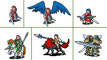
CSS – setting up the characters
Notice that I also set the height of list elements to 90 pixels and hide any text. Now it’s time for the links. We start with the generic link appearance when it is within a list tag then define the background position for each state:
ul#fire-emblem-characters li a { /* the position per pieces */
/* the background is not repeat */
text-indent: -9999px;
float: left;
height: 70px;
}
ul#fire-emblem-characters li#character1 a{ /* the position of first character */
width: 29px; /* the size of character */
background: url('Fire-Emblem-Sprites.png') no-repeat -18px 8px; /* the background of list item */
}
ul#fire-emblem-characters li#character2 a { /* the position of first character */
width: 95px; /* the size of character */
background: url('Fire-Emblem-Sprites.png') no-repeat -58px 4px; /* the background of list item */
}
ul#fire-emblem-characters li#character3 a { /* the position of first character */
width: 50px; /* the size of character */
background: url('Fire-Emblem-Sprites.png') no-repeat -164px 4px; /* the background of list item */
}
ul#fire-emblem-characters li#character4 a { /* the position of first character */
width: 69px; /* the size of character */
background: url('Fire-Emblem-Sprites.png') no-repeat -10px -66px; /* the background of list item */
}
ul#fire-emblem-characters li#character5 a { /* the position of first character */
width: 85px; /* the size of character */
background: url('Fire-Emblem-Sprites.png') no-repeat -78px -60px; /* the background of list item */
}
ul#fire-emblem-characters li#character6 a { /* the position of first character */
width: 65px; /* the size of character */
background: url('Fire-Emblem-Sprites.png') no-repeat -164px -61px; /* the background of list item */
}
We used CSS’s background-position property to define the character. The background-position takes two (optional) arguments: horizontal position and vertical position. For example:
 .introduction {
background-image: url(bg.gif);
background-position: [horizontal position] [vertical position];
}
Using this property, you can define the exact position of the background image for the block-level element (list item li). You can use either % or px units (or mix both) to define the starting position (i.e. the upper-left corner) of the displayed part of the master image. Alternatively, you could use the following keywords: top left, top center, top right, center left, center center, center right, bottom left, bottom center, bottom right.
Do you know why I wrote -164px or similar value below 0? Back to my image, the top left position has x-axis and y-axis, so the position of each character was below 0px.
What you see is what you get
As you see, 6 characters has been display inline but it’s generated by only 1 image. The loading time decrease more than 30%!
What’s Good About It?
- Lightning fast after the first view.
- You can reduce the number of HTTP requests and it is a page optimization technique.
- Decrease page content size to loading.
- Not dependent upon a server-side language, like FIR is.
CSS Sprites are the preferred method for reducing the number of image requests and reduce the total files size.
What’s Bad About It?
- Time Spent Slicing a Design Will Increase.
- Time Spent Coding and Maintaining Will Increase.
- Not Everything Should Be a Background just as the figure in content.
- Improper Use of Sprites Affects Accessibility.
- CSS sprites don’t seem to print properly in many browsers.
In those cases, mega sprites may cause more trouble than they’re worth.
Where Are CSS Sprites Used?
Apple uses CSS sprites for various states of its main navigation menu.

YouTube takes a vertical approach to its buttons and icons. The whole sprite is 2800 pixels in height!

Dragon Interactive: A design agency with a colorful, vivid CSS sprite for the navigation menu.

Tutoriral9 – A Beautiful CSS Sprites for menu



Thanks, the articles is usefull. Great !
Hi bro, thanks for your article, it very useful for me! Good job!