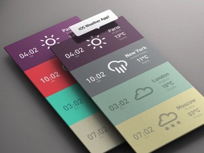
The inception of flat design has created a great buzz among the entire design community. It possesses a great place in the digital world as it has revolutionized both web and mobile designs with an optimal approach.
There are numerous factors that have contributed to the need of a minimalist design. To better understand its massive popularity across the globe and its usage, let’s ponder into its history.
A flat design is completely opposite to the skeuomorphic design approach. It simply corresponds exactly to its name “FLAT” and thus, doesn’t possess any 3D component. This means flat design doesn’t embrace any visual depth in the UI elements.
History of Flat Design
 What lead to emergence of flat design is the fact that previous design inspires a change in a famous design. According to flat UI design, an interface can offer better interaction with the viewers without integrating any visual dimension or extraneous fluff. It, thus, has been evolved to criticize the skeuomorpohic design, and deliver a more effective and efficient solution.
Indubitably, skeuomorphic design has aided a functional purpose. It has contributed to the UX design, so that viewers can understand and appropriately interact with the latest technological devices. The rich skeuomorphic design basically makes the graphics more realistic and detailed. This design approach does make the interface more appealing and intriguing, however, it has also caused certain designing issues with the devices advancing with higher resolutions. Moreover, with so much flashy elements the core content of the website has certainly started losing its impact, which was not acceptable.
To overcome these designing bottlenecks, the flat design has emerged and certainly garnered a great momentum. The minimalist appearance with a simplified UI has added to the credibility of flat design. This design approach emphasis on the core content, key functionalities and simplicity of the product. Whether it is an app or website, the flat UI helps make digital design more interactive and engaging. It, thus, adds to a great UX.
There are basic key principles associated with a flat UI design that designers must consider while designing.
Absolute Typography and Color
 The flat design doesn’t support any attention grabbing design element like gradients, drop shadow, to name a few. In order to make a design visually appealing, it supports vibrant and bold color palettes. These color schemes are much brighter than the colors that were used in skeuomorphic design.
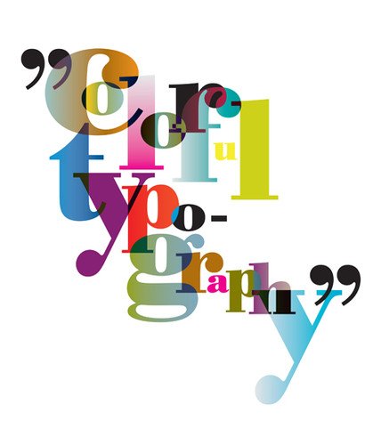
As far as typography is concerned, in flat design, content is the core element of an interface. Thus, this design approach holds reins in typography that allows one to set an appropriate design tone for a project. There are numerous typefaces available in out there that allow designers to establish a desired appearance for their design. The overall look and feel can be further enhanced by incorporating a best suitable font. The font family offers a minimalist appeal to flat design. Furthermore, to ensure an effective deign, it is advisable to implement a simple and meaningful content rather than using flowery language.
No bells and whistles: Minimalistic Simplicity
The minimalist visual appearance of the flat design makes it stand exactly opposite to the skeuomorphic design. Unlike other designs that embrace sliders, animations, 3D effects with shadow and gradients, and a lot more attractive UI elements, the flat design simply says a big no to all these. No embellishment is implemented in flat design, rather according to the flat design, the simple content, simple UI elements and vivid color palettes are the key to an impressive UI design.
Basic UI with simple shapes
The flat design supports simple shapes like square, rectangle, etc., for integrating different UI elements like navigation, buttons, and more. However, designers can also implement circular, triangular or any other shape that best complements their UI pattern. There must be consistency between the flow of actions to ensure a smooth performance; although, it allows captivating color contrasts to grab viewer’s attention to CTA (Call-to-Action) buttons.
Does flat design diminish the possibilities for creativity
The mantra behind the flat design is “less is more”. However, there are some designers who believe that rather than choosing a minimalistic approach, there must be some design solution in between skeuomorphic and flat design. This is because, according to them, there can’t be much variation in flat design, therefore it might appear boring to viewers. Moreover, as flat design primarily focuses on functionality with a simple design strategy, a too flat design can also hamper the usability. For this reason, the flat design demands more precision.
What I believe is that, no doubt, there are several limitations in this design strategy, but it can help fuel creativity, as restriction will force designers to seek alternatives to this approach.
To conclude, Flat design is surely in vogue and have been further enhanced by Google to material design (as unveiled alongside the Android 5.0 Lollipop). The web and mobile design trends are ever fluctuating fields, if you want to ensure a surefire and sustainable design, it is imperative to stay updated with the ongoing trends and latest developments.