At a time when we have already become used to great interactive user interface and smooth user experience in countless apps, it is very likely that apps lacking good UI and UX will not be tolerated. Thanks to an array of quality apps that we use frequently, our expectation and perception in relation to UI and UX is generally high. So, unlike the first generation app users we are more merciless to apps with underperforming UX and non user-optimized UI. Users got used to good app design and so design should get used to quality benchmark.
Principles of interactive design
A design which is centered on the understanding and collaborative capacity of real users is interactive design. Basically an interactive design helps users to engage, interact and collaborate with an app. How unique an interaction with the users can be facilitated, how well the interactions help users in getting what they want from the app and how fast, smooth and glitch free an experience you provide through your design, precisely these are the qualitative parameters of interactive design.
Using interactive design principles has now become a necessary prerogative than just an option as it was few years ago. To facilitate more meaningful interactions and to help users fulfill their objectives through these interactions, these are two most important considerations of interactive app UI and UX design. Here are 5 key interactive design principles that mobile apps cannot do without.
- Guiding user to next step through clear call to action
- Customized and device specific interactions
- Adhering to established convention of icons and navigation
- Limited information per page for clutter free visibility
- Design equipped for receiving real time feedback and response from users
Key UI design principles
Exploding range of mobile apps with unique UI is now keeping app designers and developers on their toes. Everyone is looking for something new and winning. But in spite of the pace of advancement in technology and evolving range of devices the basic and fundamental principles for designing successful mobile apps still remain mostly unaltered. Let us provide here some of the key principles of UI design.
Focus on content
Any app should primarily focus on app content. UI should optimize viewing contents in every possible way.
Intuitive interaction with suggestive options
UI should be precise and implied and should use suggestive placeholders for intuitive interaction. As users today want to know the next thing to do just at a glance rather than searching for it suggestive options must be provided.
Making use of variation in backgrounds
To suggest different actions and their importance overlays and blurred backgrounds in and around buttons can be useful. With color variation and blurred background you can give them intuitive suggestions for what they want to do. This offers a fluid UI with introspective action.
Clutter free navigation
Clutter free navigation with least amount of design elements will further add ease to the user input. The navigation in mobile devices is narrow and so they should be given a neat and well organized look with less details and graphics.
Less buttons and contextual display of navigation buttons
When it comes to navigation buttons UIs of first generation apps were full of them but with time they decreased steadily. Now buttons remain mostly hidden and they show when the user really need it. This contextual and intuitive button display has now become a standing UI principle for overwhelming number of mobile apps.
Large and flat buttons
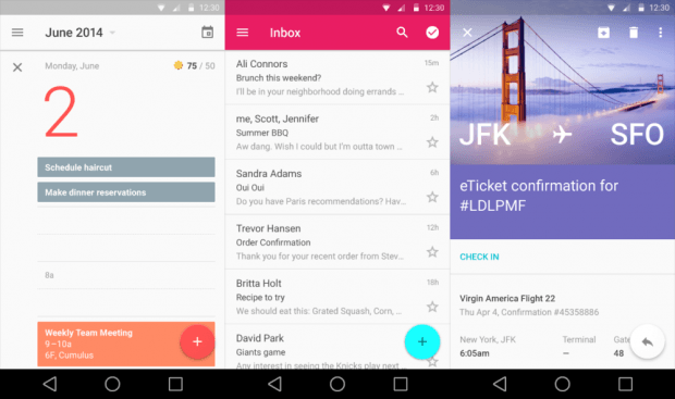
Large flat buttons creates certainty for user interaction and make input easy. Large buttons can be further aggravated by using flat color. Large and flat buttons are particularly helpful in alleviating constraints of mobile screen size.
Interface with few elements
Unlike desktop and web interfaces that are cluttered with links and gamut of information, mobile interfaces should be neat and clean without making the screen crowded.
Integration of intuitive input gestures
Finally, it is the integration of intuitive gestures in app UI that would make the app smart and reduce confusion of user as what to do next.
Key UX Principles
As mobile became the center stage to compete for engaging users with business apps the value of User Experience or UX has never been bigger as it is now. A good app is differentiated from a bad app by the quality of its UX. UX is crucial for more contextual user interaction. Let us have a look at the key UX principles recommended for today’s mobile apps.
Integrate animation
In modern UX design animation is absolutely a part. The use of animated characters gives interactive elements of a mobile app a dynamic real world-like feel. Animation creates a moveable, light and crisp feeling which the user instantly likes.
Full screen view and simultaneous navigation access

Allow users undo actions when they need
The UX must allow the user undoing certain important actions that they consider as mistaken. For example, after any transaction input in any app the user should be asked to confirm or alternately to cancel. In this way the user will be more at ease while always feeling secured.
Make app login as easy as possible
Finally, it is extremely important to make users feel free of any constraints while using the app. Constraints like the requirement of login in or providing some personal details are directly detrimental to the user experience. If login in to the app is absolutely necessary make the process short and offer them alternately social login option to save their valuable time.
Most Dominant Mobile UI/UX Design Trends in 2015
This year we have already seen a phenomenal rise in high end mobile devices with exploding range of device capabilities and UX support. With robust design maneuvers for mobile apps all across the globe we have already come across an array of most brilliant UI/UX examples with state of the art technology and user engagement attributes. Let us now have a quick look at the most dominant mobile UI/UX trends so far in 2015.
- Flat UI

Flat UI
Flat UI is much appreciated for simplicity and usefulness and as focus on app content is increasing it is gaining popularity at rapid speed. The flat UI is known for ease of access, quicker navigation and better visibility. Flat UI is also evolving with incorporation of diverse design approach like color layering even among flat buttons and use of animation, etc. - Full screen navigation
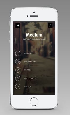
Full screen navigation as a UI trend has been a mainstay across a variety of mobile apps launched this year. Full screen navigation makes it extremely easy to navigate through the app, access pages through clear and large menu and offer a ravishing full blown impression on the first time users.
- Contextual UI
The consistency of user interface has become already a matter of past with the new trend of contextual UI. Now the powerful device sensors can inform about the location, activities, movement and user behavior. With this sensor produced feedback the app can offer user options according to his location, preference, etc.
- Synchronous UI for multiple devices and wearable

Synchronous UI for multiple devices and wearable
Now most users are having more than one mobile device and many of them have wearable devices as well. Naturally, the same app UI should offer ease of access and usability standard on different devices including the wearable. Agility in UIs is becoming important to address this emerging multiple mobile device reality. So, more agile and synchronous app UIs now became a dominant trend. - Storytelling through UI
For better customer engagement storytelling through UI has gained popularity across various mobile apps this year. Storytelling helps the app to tell the story of the company or brand and the products and helps in building an attachment on the emotional plane of the customers. The enhanced HTML5 capabilities further offered boost to this UI trend.
- Navigation tiles
Navigation interface with tiles much in the fashion of typical Windows 8 interface has been a widely popular trend with many apps. Showing the app contents, menu and other visual elements in card or tile format is good for clearly viewing the contents at a glance. Moreover such design is responsive on multiple screen sizes.
Obviously the trends mentioned above are not the end of the world for mobile app. In the rapidly evolving mobile app scenario these trends only represent some crucial turns and shift of focus across user expectations and corresponding design approach. Nevertheless, we feel ourselves excited to see how these trends fair in the days to come. The mobile app design is going to be more intuitive and context driven than ever before.


Hi
Thank’s for the interesting post! I’ve got some useful things there!
Taking into account the Mobilegeddon 2015, provided by Google the UI and UX are the key factors of success. Responsive design is a vital thing for mobile apps in near future.
What can you say about Call-To-Action implementation into mobile apps? What are the trends?