In the previous article, you already know a number of services to help you convert your website to the mobile version which compatible with mobile devices. However, using third-party web development services are more limited, customization capabilities depending on the vendor even if you have to pay to get better service. By building a website ready for mobile version delivers more benefits than the cost of maintenance and system upgrade.

During construction, there are several unique issues for mobile devices is completely different from the normal computer.
Page sizes and images
Page sizes and images is one of the issues that need attention, even though current connection speed fast enough to able to view all video on the network but in the developing countries test loading a page> 100kb is not simple; your website for everyone, not just in some areas have not given?

In my experience you want your page size is less than 40kb.
Be careful with JavaScript, flash, video ….
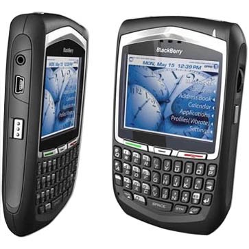
Only little mobile browser support JavaScript such as BlackBerry Browser, IEMobile … though it is not fully supported to be able to process them as the browser’s computer and it similar to flash, video
Unsupported Technologies
Even JavaScript provided very limited work on the new mobile browser (BlackBerry Browser supports really good to handle tasks normally JavaScript) so you do not ever think to applying new technologies such as AJAX , playing video on your browser, use the flash without the assistance programs.
I know there are several solutions on mobile devices enabling the AJAX code through software complement, but not yet used any kind of formal all.
Small Screen Size
If you’ve ever tried to browse the Web on a handheld mobile device, your first thought was probably that the screen was incredibly small compared to your desktop or laptop.

Some issues will be occur when displayed on small screen
- Websites which make use of tables for the main layout will not look right on mobile phones.
- It is difficult to enter text in mobile Web sites. You may want to offer your user the convenience of radio buttons and lists, which they can choose from depending on what they need.
- Horizontal scrolling is especially bad on the smaller cell phones will be appearing.
Things need to do when building a website for mobile devices
- Because mobile devices can not point as mouse on the computer so need to make shortcut to allow readers can quickly move between content.
- A good mobile Web site design provides back buttons and links. Many phones are not equipped with back buttons, so try to provide one.
- Your site must use CSS for the layout to make sure maximum compatibility. Because the different mobile phones have different screen sizes. This is a major headache if you want your mobile Web site design to run on all of them.
- It is difficult to enter text in mobile Web sites. You may want to offer your user the convenience of radio buttons and lists, which they can choose from depending on what they need.
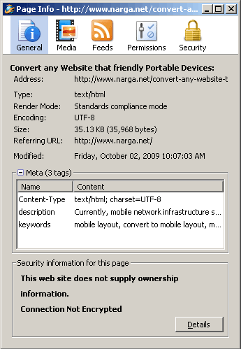
- It is easiest if your site is coded using either XML or XHTML, with your character encoding set at UTF-8.
- Most of the mobile phone emulators do a good job at giving you an idea of how pages will look like. Use them to find major problems and test it.
- Integrated statistics feature is able to recognize your habit to use readers.
Take some time and invest in the creation of a small but efficient mobile website so you at least know you have another base covered in the realm of online marketing
To test how your pages and Web Apps will look on an iPhone, you might want to check out MobiOne. Unlike other “emulators,” it gives you device behavior, not just rendering. This includes multi-touch and gesture support.
Thanks for sharing your thoughts. We’re excited about the mobile Web as well!
http://www.genuitec.com/mobile
Jens
Genuitec