Contact pages can often be just as important as a website’s homepage. A good contact page is essential for maintaining relationships with your visitors. It is the channel your users and clients have to communicate with you. It can help a lot in increasing the sales and conversation rates of a website. However, sometimes, most of the users ignore this feature in a lot of websites.
Following are some of the simple important tips will definitely lead you to design a perfect, elegant and attractive Contact page. Let’s put that right.
Make your Contact Form reachable
Your contact page needs to be reachable by a single click so that people are not fumbling to find your information and turn to a competitor with a more straightforward link. Make sure that users easily reach your Contact Us page. If users can’t find the Contact Us page, then it will be a useless thing.
Generally speaking, contact information can be found in two places:
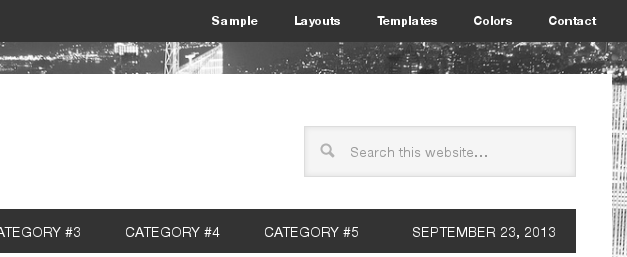
- Website’s Navigation includes Primary and Sub Menu. Visitors usually look for contact information on the right side of a page because it is seen as an element of secondary importance. For this reason you’ll commonly see the contact page link as one of the last elements within site navigation. So, placing a link to the contact page in a drop-down menu might best be avoided as it could easily be overlooked.
- Website’s Footer is also a popular location for contact information. This position saves your site visitors from spending time going to your homepage and searching for the contact link.
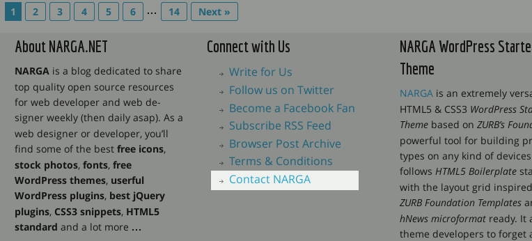
Anticipating visitor flow to a contact page is tricky, so placement of a link in at least two locations as mentioned covers you quite well.
Fewer form fields
Nobody wants to fill out a million form fields, so consider how easy or hard it is for someone to actually complete your form. Just keep it to the point and try not to ask a lot of personal information. This is because some people hesitate in giving their personal information due to privacy issues. Look at your contact form and decide what must stay and what can go. Do you really need people’s daytime phone numbers? A real address? Unless you have a good reason to ask for more, then asking for a name, email address should be sufficient.
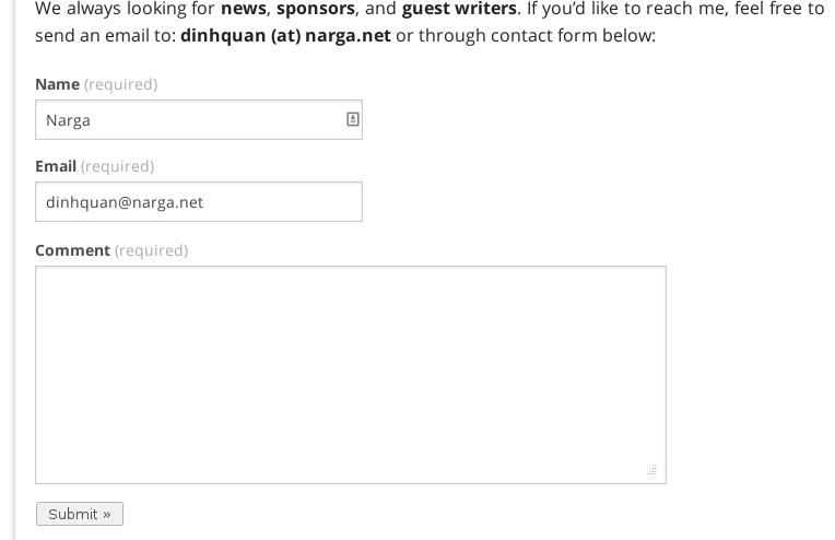
Offer a variety of contact methods
Where appropriate, include links to your products or services pages, customer service or technical support, your newsletter sign-up page, and/or your FAQ page. Why don’t you provide your social account that helps customers contact you faster and simpler, post links to your social media sites, like Facebook and Twitter, as further options for communication.
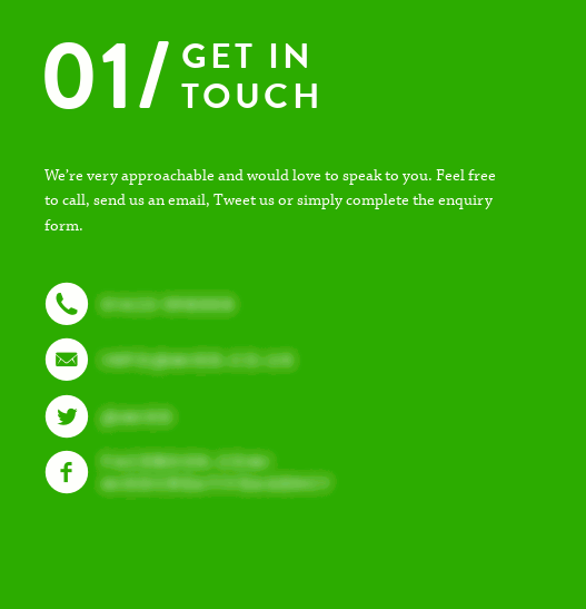
An email address should use the mailto link.
This allows visitors who click on it to send an email without first having to copy the destination email address and open an email client. But if you provide a real email address with a mailto: link, you will get spam issue because spammer’s robots picking up your email addresses. Therefore, you may want to think about first obfuscating email addresses using a service such as mailtoencoder.com or similar service.
If you have a physical location, show how (and when) to get there
 Thanks to Google Maps it has never been easier to embed this useful feature. Over 150,000 websites use Google Maps in novel ways. This makes it very easy for the visitor to find the exact location of your organization.
Give your page a little personality
If you’re trying to attract new customers, showing that you’re a real, live human being is a definite plus. Make it friendly, inviting and give people a reason to want to get in touch with you. No need to write a novel or a long list of services or benefits. Just make it clear, friendly and tempting.
It is better if you offer multiple ways to contact your company management. Always include additional contact information. This gives users more options of contacting the organization if the telephone is engaged or if the email bounced.
Make Your Contact Page Pretty
Why don’t you let the form be the pretty girl at the party. No need to showcase your artwork, fabulous graphics, amazing photos or anything else on this page. Just a beautifully laid out stack of wonderful fields so that a person can focus on contacting you.
For contact forms it’s best to stack all fields vertically instead of placing them side by side. This reduces the number of eye movements visitors need to make in order to fill out the form. If you’re using a contact form, make your fields large, friendly and enticing to fill in. White space and padding can come a long way. For starters, make the font on the field labels large enough and align them properly with the fields.
If you can make your contact page pretty by yourself, it’s worth hiring someone who can.
Are you running a WordPress website, let’s read on, I will recommend you some userful WordPress plugins which held you create an attractive and beautiful Contact Page without known how to coding like it.
WordPress Contact Form Builder
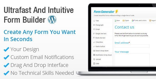
Create Beautiful Forms In Seconds With The Most Powerful WordPress Form Builder Plugin
- Create Unlimited Contact Forms, Online Surveys, Booking Forms Or Event Registrations In WordPress
- Get More Contacts And More Leads With Forms Matching Your WordPress Theme Instantly
- Work Less With No Coding And Zero Programming Involved, It’s Super Fast And Easy To Use
- Have Complete Control On Your Forms Design Without Coding Any HTML Or CSS
- Know Exactly Who Is Contacting You With Our Social Networks Integration
No Coding Involved, No Programming Skills Required
Don’t Waste Your Precious Time On Difficult WordPress Coding Anymore. Focus On The Creative Aspects Of Your Forms And Leave The Technical Aspects Aside.
Yes, coding for WordPress is difficult, this is why we wanted this form builder to be as easy-to-use as possible so that you can focus on your website content instead of PHP and CSS coding. All your forms will work right out of the box.
No knowledge of HTML, CSS or PHP is necessary to have it all working properly.
- No CSS Headaches: use our powerful color palettes and font selector to give any style you want in your form.
- No PHP Coding Required: each form is created with its own php validation files, you won’t need to code anything to have it working properly
- High Quality Code Guaranteed: Form Generator delivers clean HTML coded forms fully compliant with W3C standards
AJAX Contact Forms

This is a jQuery based AJAX powered HTML/PHP contact form with Twitter Direct Messaging, easily integrated into WordPress via shortcodes and functions.
Features include
- AJAX powered (no page reloads!) Save your bandwidth!
- Instantly notifies you via the Twitter Direct Message API as well as via E-Mail.
- Very easy to integrate into any existing WordPress page on your website.
- All fields have a validation script so you get the * required info you need.
- Improved Anti Spam ‘Captcha’, are you human? verification.
- Make as many forms as you like, and customise them, all via the WordPress admin panel.
- Integrated Animated Sliding Thank You / Success page.
- Integrated AJAX Javascript Sliding Error notification, if fields aren’t correct or incomplete.
Contact Form 7

Contact Form 7 can manage multiple contact forms, plus you can customize the form and the mail contents flexibly with simple markup. The form supports Ajax-powered submitting, CAPTCHA, Akismet spam filtering and so on. It has 14,083,651 downloads and worth to trying. With this plugin you start at the bottom and can really build something with it. If you want too that is. Or just make an easy contact page. The best thing is you can just add the code to any page and any where on that page. So it gives the look that you did it and it’s not just a contact form page that just don’t fit the look of your sites theme.
Usernoise Pro Modal Feedback & Contact form
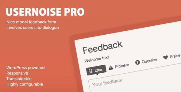
Usernoise Pro is a minimalistic WordPress plugin for gathering and discussing users feedback thus engaging them into communication.
If your site does not use WordPress, a standalone version is available.
Main Features
- Adds a modal feedback window with item discussions. No coding required.
- Sexy and responsive design with a number of typographic presets.
- Highest level of theme compatibility possible.
- Editable feedback categories with 4 built-in caregories.
- Feedback statuses, like “New”, “In progress”, “Rejected”.
- Feedback form can be shown on the page.
- Non-WordPress site support. Usernoise can be used for non-wordpress sites by installing WP into a subfolder and copying a couple of lines of code from the admin area.
- Auto-updates supported
- New in 2.0 100% compatible with any theme.
- Stores comprehensive WordPress and HTTP debug info along with the feedback gathered. Two debug levels available.
- Multisite-compatible
- RTL supported
- You can reply to feedback right from email client when receiving the notification.
- [usernoise_link] shortcode to link to Usernoise window
- Localization ready. Just install a free CodeStyling Localization plugin and localize it to your needs in seconds. I will highly appreciate if you’ll contribute translations back.
Fast Secure Contact Form

Easily create and add forms to WordPress. Fields are easy to add, remove, and re-order. The contact form will let the user send emails to a site’s admin, and also send a meeting request to talk over phone or video.
Easily create and add forms to WordPress. Fields are easy to add, remove, and re-order. The contact form will let the user send emails to a site’s admin, and also send a meeting request to talk over phone or video.
Features:
- All new improved 4.xx version code base.
- New user interface with tabs.
- New ‘Fields’ tab where you can re-order the display sequence of all the fields via a drag and drop interface.
- Forms are easy to add, remove, label, and edit and preview. Add as many as you need.
- Comes with standard fields of (Name, Email, Subject, Message). Any of the standard fields can be disabled.
- Fields are easy to add, remove, and re-order.
- Add extra fields of any type: text, textarea, checkbox, checkbox-multiple, radio, select, select-multiple, attachment, date, time, hidden, password, fieldset(box). See FAQ
- File attachments are supported, see here for details: http://wordpress.org/support/topic/416371
- Backup/restore tool. You can backup/restore all your forms or single forms and settings.See FAQ
- Easy to hide subject and message fields for use as a newsletter signup.
- Send mail to single or multiple contacts.
- and more …
Quform – WordPress Form Builder
Quform is an advanced WordPress plugin that allows you to quickly and easily build multiple forms with total control. If it’s a complex quote or booking form or just a simple contact form, Quform will allow you to do this without touching any code. In a few clicks you will have a fully functional form. It’s that simple.
If you use WordPress, require custom forms and don’t like wasting time or simply don’t want to touch any code then this is the must have tool for you.
Using the form builder is made simple with drag and drop and one click functionality and it works in all major browsers. There are options and settings for the basic user and for professionals. There are far too many features to list them all here, so here are the favorites:
- Create a form without knowing any HTML or PHP!
- Drag and drop form elements
- Fully translatable
- Easy to use user interface
- View submitted form entries inside the WordPress admin
- Send submitted form data via email
- JavaScript calendar (datepicker) with 24 themes and 62 languages
- Export submitted form data to Excel / OpenOffice
- Conditional logic to show/hide fields
- Dynamically set form values from the URL
- Fully supported form inside a lightbox
- File uploads, sent as attachments or saved to the server (or both)
- Preview while building
- Flash upload progress
- Group elements for complex form layouts
- 15 included element types
- Conditionally set recipients based on form values
- Custom autoreply
- 6 optional filters to strip unwanted submitted data
- 9 optional validators to require specific data from the user (and create your own!)
- Import/export forms across websites
Not only does the Quform take care of the functionality, it can very easily make your form look great too. Quform has a unique form theming system. You can use one of our themes, create your own theme or use other peoples theme designs. For the more advanced user, you will not be disappointed with the flexibility of the styling features of Quform. You can have total control of your form design and there are plenty layout options so you can take it as far as you like.
- 3 themes included with 5 variations
- Create your own themes
- Easily edit the CSS of elements via the form builder
- Use a variety of label placements to display elements
- Uniform (Sexy forms with jQuery) included
- qTip2 Tooltips with 12 included styles
- Group elements to separate sections or for layout
- Unique identifiers make it easy to manipulate an element
- Customize inputs with onscreen color picker
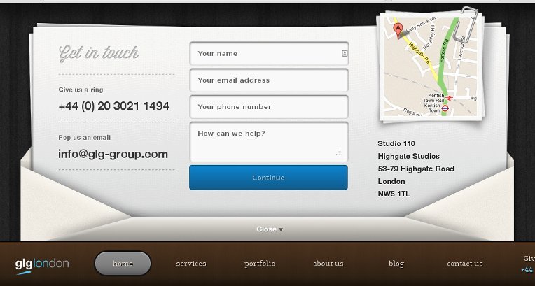
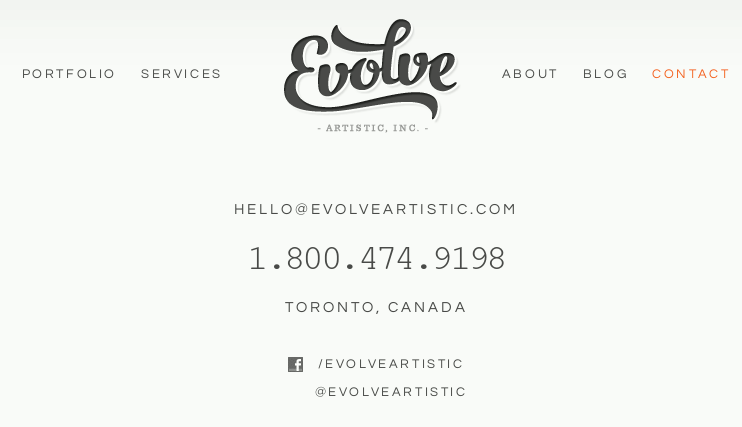
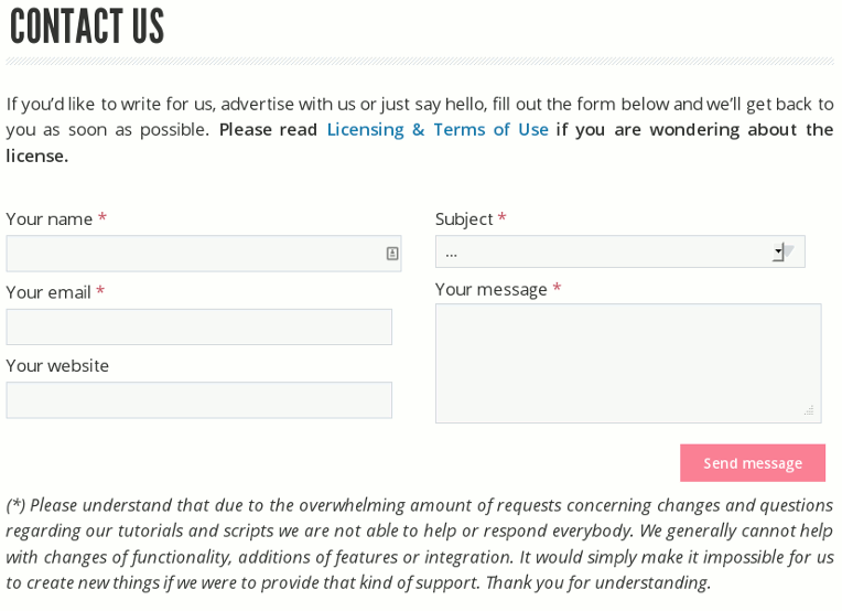
Inspiring Examples of Contact Pages
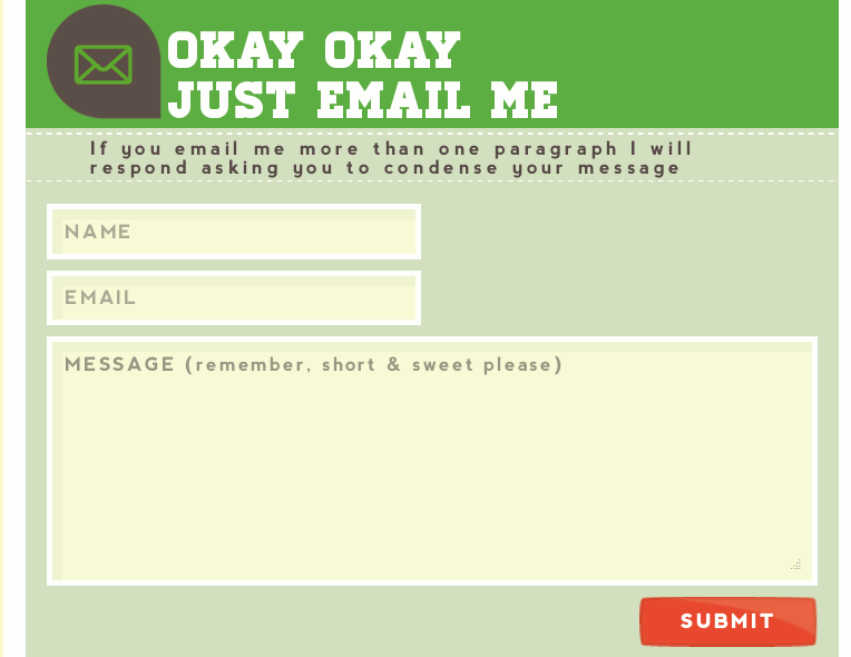
Talking about good contact forms, let’s take a look at some examples for inspiration.
Conclusion
The poor Contact page is usually the last thing on our minds when we update our websites. But it’s the Contact page that’s going to turn all that gorgeousness and effort into customers and sales.
Following are some common tips in this post with the help of which you can create a neat, effective and professional looking contact page. For sure it might be overkill for some, however good developers will take the time to offer options to a client and work with them to determine the right solution.