“If something fulfills its function, it is inherently beautiful” ~ Socrates
As per the halo effect of cognitive biases, a particular trait more specifically good characteristics, influences a user and extends to other qualities of the person and this effect biases one’s decision with the tendency to focus on good. This news ran rife when the competition in web development transcended to a great level.
As the web has transpired to be a one of the most reckoning force, no business owner is ready to compromise with their online business, and when it comes to the face of any business, you got to be great shakes to edge out competition.
The resultant of this has brought got the designers working on the mathematics behind a great design improvements and have come up with some exceptional web designs. Web design is no more just a pretty face that allows the user to browse through the designs but has emerged as a great engagement tool for the users.

What are we trying to do here?

Though I am not a cricket fan, there was this great movie of which I would like to mention as that portrayed how an aurally disable guy bowls so as to make the batsman do what he requires. So for this he sets the fielders accordingly and at the end he wins. I don’t know whether the developers of Z design saw that movie, but I am pretty sure this story falls inseam.
Similarly, Z design is the fielding set of our metaphorical batsman which are the online users, so that we can make them see what we want them to see and this leads him to take actions that we desire of him.
Savvy!
Now that we know that why we need this Z layout design thing, so now we will further proceed to the definition of Z design, how can we implement it, go through some examples and at the end cautionary things.
What is Z design all about?
Now that we know that Z design has gained a lot of credence in web development this means it will suit to the website of all genres.
However, it is one of the quality methods as it is designed to tackle to 4 design principles that form the basis of a good web design. It gives you a properly interconnected channel to start your branding then goes to the hierarchy, structure and then strategically reach to A Call to Action.

This also fits the scanning phenomenon of most of the readers as they first scan a page top to bottom and left to right. If you keep this foundation, then you can probably make the user go wherever you wish them to go. This allows you to place your call to actions properly, resize your Z-layout as per your wish. You have the leverage to extend it or shrink it to fulfill your design goals as your desire.
Getting familiar to Z-Layout
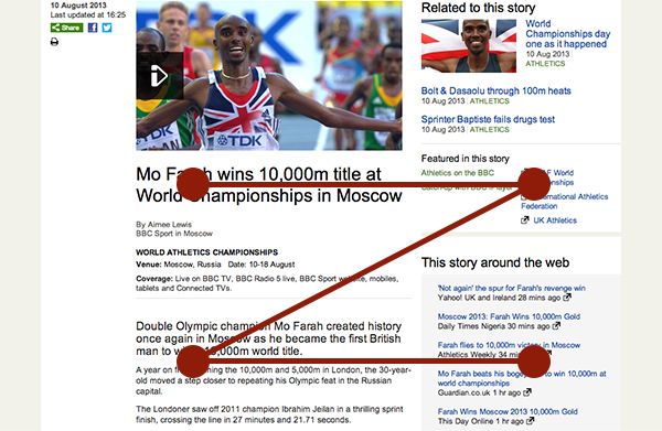
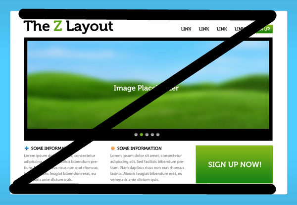
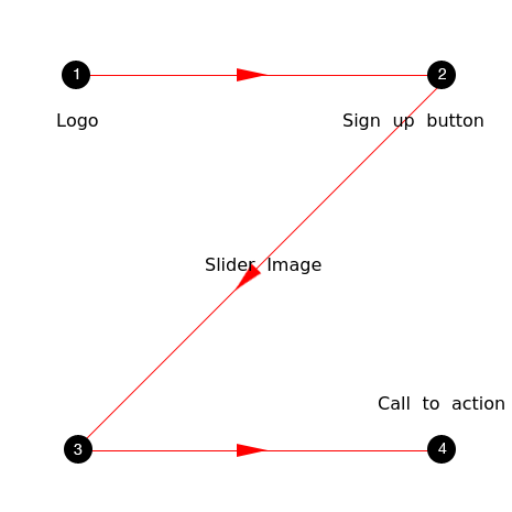
Now just look at this Z on a page and naturally the reader goes to the top of the page which is the first horizontal line of Z. Likewise, the end of the Z must have the call to action as it the culmination point and can also be seen in the diagram below:

The junctions which are the key points are numbered, and they are in the order in which the readers will go through the elements placed on your page.
It is certainly not a rocket science to understand this layout as it is not at all complex. One needs to remember that the human eye moves quite swiftly from the top and end points and not in a haphazard manner but a sequential one. And at the end of the powerful action, you need to make sure that the call to action must be at the end point. The reason behind this is that after going through all the benefits, this is the right time for the reader to take an action.
However, it would be quite simple if you do not do incorporate your creativity to enhance your user’s experience.

We can certainly go for background separation to catch the focus on the design. Make sure that you get an eye catch logo to attract the visitors. You can add a sign-up button at junction number 2; this point is taken as a reinforcement point where you can create an impact.
To separate the top and the bottom section of the blog, you can make use of slider image in the smack of your web page which also catalyzes your eye movement. When it comes to icons, place it along the bottom axis, and this will help to improve the visibility of title as the focus will be then on the call to action. Then lastly, place the “call to action” on the last point as this becomes an awaited feature by then.

It is quite apparent that this web design layout is quite a simple one, but it is the simplest things that come with phenomenal results. This further gives you the leverage to make your website more feature rich using your creativity.
Movement in Z layout

As its name indicates the Z-layout is inspired from letter Z. As the letter beings from top-left, likewise, the readers are expected to start viewing horizontally to from left to right and then move to the diagonal corner at the bottom right before completing the movement to the bottom- right corner.
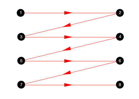
This design layout is also known as reverse-s-pattern in web design, which covers a curved movement and not just specifically goes to the straight and angled path. Apart from this, they are one and the same things.
When comparing with the Gutenberg diagram the Z-pattern suggests that the website visitors will go through two fallow areas.
Else they still move back again to the starting or the ending and again go back to the middle. If we go with Gutenberg principle, the designer needs to place important information in the path of this pattern.
Despite being so calculative, we need to note that this web design layout works best for websites that do have an ample lot of functionalities and only have a few features to portray on their website. Moreover, you can also follow this pattern if you wish to incorporate storytelling feature onto your website.
Pay heed to this as well!
In this tech space where we are facing such a cut-throat competition, we have umpteen number of design layouts and Z-layout is not the only one. With so many layouts present there you have ample lot of options to choose from. However, as it has proved its usability thus this makes Z-layout as one of the quite standard layouts. However, this does not imply that we need to choose it for our website.
Moreover, when it comes to attracting the attention of the users, then you need to know that the viewers will get attracted to bright, and big objects and contrast also attracts them irrespective of the design layout followed.
A lot of cognitive analysis have been going on to track the movements of eyes, and they have figured out that it is quit unpredictable as it might differ on the liking and preferences from people to people. Some of them also say that “F” design layout is quite effective in formulating a defined path for the eye movement on a web page.
Those who are choosing Z-layout for the web design must keep in mind that need not interrupt the user who is following a strategic Z layout flow, else the users will get distracted.
All in all, Z-layout is quite effective that the to design websites that are quite simple and do not a lot of functionalities to cater to their clients. Z-layout has emerged as a superhero for design minimalistic web designs. However, if you will try to apply Z-layout on a complex website, then you might not get quite good results. On the other hand applying this very design structure on a simple web design will help you get good results.
Enough with choices, actualize your vision
Be it any layout, sole purpose of any web design is to attract users and improve their business conversion process. Thus, it is incumbent on you to go through the pros and cons of all the web layouts and pick the one that suits the subject and nature of your website the best. As it is aptly said:
“Beauty is within the subject, not the object.” ~ Immanuel Kant
Z-layout has some great things to offer, and this is the reason it has been adopted by numerous websites. Rest everything else is dependent on how you efficiently you utilize it for your benefit.